I recently began exploring a character I developed a few years ago. As part of the process, I was able to trace back to the original doodle that got him started.
Keep sketchbooks, people! It's so much easier to look back when you work in sketchbooks. My characters are almost never premeditated...they just happen. One day I was drawing different head shapes and must've thought it would be funny to draw a character with a milk jug for a head.
As with most characters I develop, they end up popping up again and again if I'd enjoyed drawing them—often over long periods of time. You'll see the head pretty much stays the same, but the body changes.
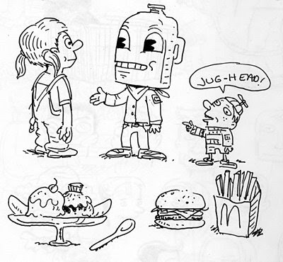
Here I decided he should be a wholesome character (what's more wholesome than milk?), so I dressed him in a boyscout uniform.
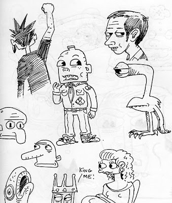
And here he appears again, several pages later in my
sketchbook...same idea, but a different take.

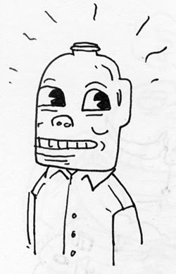
This drawing is the most refined of the bunch. You can begin to see his personality showing through. And his design is more fleshed out. I'm a firm believer in drawing a character over and over to allow its soul to emerge. So many characters are designed without personality because they are rushed. Or personality is considered after the fact. It appeared this wholesome milkhead should be kind and responsible, but modest and unsure of himself.
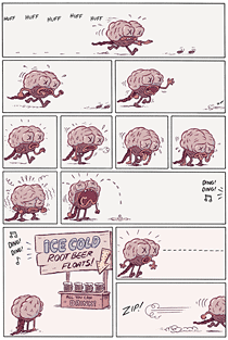
It was at this stage that I thought I would try him out in a comic. It's possible an entire year passed between initial doodle and comic. The story plays out below—basically, a one-page story of a scout whose good intentions go awry.

Now for most characters, that would be solid ground to stand on. I had a character I liked, and a decent idea of how I would use him—to put him in situations where he tries to be a good samaritan, but would be forever plagued by bad luck. This comic dates from 2005 (3 years ago), so I'd obviously lost touch with the idea. Until the other day.
I was drawing him again when I wondered if maybe he looked too old. That perhaps he would work better if he were younger...making him more of a cub scout and more vulnerable to catastrophe. More likley to get into trouble, too. I was also thinking about character appeal, wondering if a comic like this could work for a younger audience (if they would identify more with a younger looking character). Lastly, I considered simplifying his design a bit.
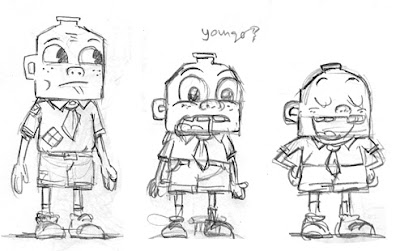
Something became immediately apparent. What surprised me was how making him smaller and cute didn't really make him more vulnerable. For some reason he started looking more bold and assertive—more sure of himself. He was suddenly becoming a brave little cub scout, one I could see going on adventures.

I tried to take it back a notch as I started drawing him in Flash. You can certainly force a character to look uncertain with an expression. But something was there with the 12-year-old milkhead that isn't happening with the smaller guy, yet. In an attempt to monkey with his design, I noticed some of my tendencies as a cartoonist. That characters of a certain stature almost beg to be tricksters, or at least have a lot of spirit in them.
After all this time, he still doesn't have a name. I'm gonna play around with him some more, but I thought I'd share this process with you all. I'm sure most have had similar experiences developing characters. Leave your thoughts!